
Claude Code for Designers: A Practical Guide
A Step-by-Step Guide to Designing and Shipping with Claude Code

I’m not a developer. Well, not anymore.

But in my early career, I worked as a full-stack developer and designer at creative agencies. Back then, we called it being a “webmaster.” You did everything: design, frontend, backend, deployments, the whole stack.

Over the years, I focused on design strategy and moved away from writing code daily. But I never stopped keeping up with development, especially frontend. It was always there, like a skill I’d put on pause but never forgotten.
Then Claude Code came along, and it felt like unlocking something I’d forgotten I had. All that development knowledge wasn’t just useful for understanding technical constraints or talking to dev teams anymore. It became a way to ship things independently again.
Over the past few months, I’ve built more functional prototypes, internal tools, and client demos than I did in the previous year. Not by writing code from scratch, but by leveraging what I already understood about how code works.
This isn’t about “learning to code.” It’s about fundamentally changing how designers work.
The Translation Problem
For years, the advice to designers was always the same: learn to code.
I already knew how to code. JavaScript, React, Node, databases. I’d built production systems in creative agencies back when “responsive design” was cutting-edge and we were hand-coding CSS media queries.
But as I moved into design leadership, the gap between knowing how to code and actually coding grew wider. Not because I forgot, but because the overhead became too much. Setting up build tools, managing dependencies, debugging webpack configs, keeping up with framework churn. The cognitive load of switching between design thinking and syntax debugging was exhausting.
The problem wasn’t capability. It was the translation layer between design intent and implementation.
I could see the solution in my head (the interaction, the data flow, the edge cases), but translating that vision into working code meant fighting with tooling, hunting for the right packages, debugging mysterious errors, and constantly switching between designer brain and developer brain.
What changed wasn’t learning a new framework. It was finding a tool that removed the translation layer entirely.
Claude Code understands design intent and translates it directly into working software. I describe what I want to build using my designer vocabulary and my developer intuition. It writes the code. I iterate by giving feedback on what I see, informed by years of knowing what should happen under the hood.
This is what I call vibe coding. And for someone with a developer background, it’s like having a senior developer pair-programming with you who executes at the speed of thought.
What This Looks Like in Practice
Personal AI Agent for Vintage Watch Hunting
I was trying to find the perfect gift for my wife: a vintage Cartier Tank.
The problem was was time. I simply couldn’t keep up with the endless searching, comparing, and bidding across multiple vintage watch marketplaces.
So over a weekend, I decided to build a personal web app: an AI-powered agent that could help me search, monitor, and bid on vintage watches across different platforms.
Using Claude, I moved from idea to a working prototype in just a few days. Literally a weekend.
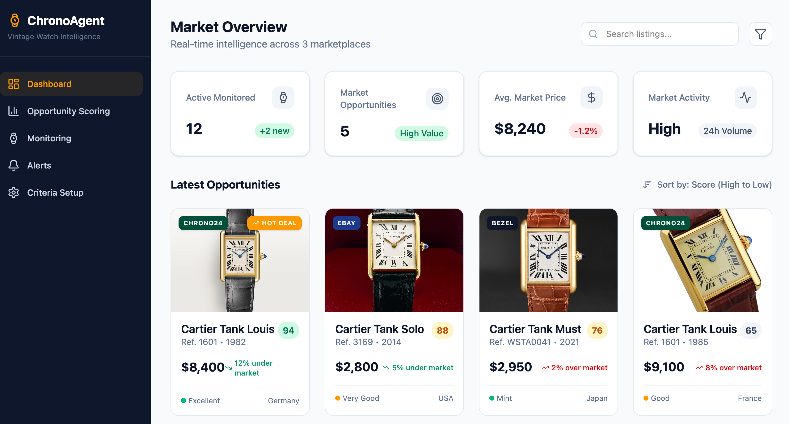
I described the outcome I wanted: how the agent should search, evaluate listings, and surface the best opportunities. Claude helped me design the system architecture, integrate marketplace data, and translate my product and UX thinking directly into functional code. I iterated by giving feedback on behavior, logic, and interactions rather than fighting syntax or debugging loops.
What would normally require weeks of development and coordination became a focused design-and-build sprint. The result wasn’t just a prototype, it was a practical tool that solved a real problem in my life, built at exactly the moment I needed it.
Project 2: Figma-to-Development Workflow
I integrated Figma’s Model Context Protocol (MCP) with Claude Code to create a design-to-development pipeline. Designers update components in Figma, Claude Code pulls the latest design tokens and generates production-ready React components.
Built in 5 days. Now running for client projects.
These aren’t just prototypes. They’re production tools that real people actually use.
The Full Workflow (Step-by-Step)
Everything you need to know as a designer, non-technical edition.
Step 1: Set Up Claude Code + Get Shit Done
You need two things: Claude Code (the coding agent) and Get Shit Done (the meta-prompting system that makes it think like a designer).

Install Claude Code
On Mac:
Open Terminal (Applications → Utilities → Terminal) and run:
bash
npm install -g @anthropic-ai/claude-codeIf you don’t have npm, install Node.js first from
https://nodejs.org
On Windows:
Download the native installer from Anthropic’s website.
Verify it works:
bash
claudeYou should see Claude Code launch with a welcome message.
Install Get Shit Done
This is the step most designers skip, but it’s actually the most important one. Claude Code is powerful, but without proper context engineering, it degrades as the conversation gets longer. Get Shit Done (GSD) solves this.

What GSD does:
Thinks like a product designer: questions everything, captures edge cases, explores alternatives before committing
Prevents context rot: keeps Claude sharp across long sessions by structuring information properly
Enforces spec-driven development: no vibe coding chaos, every decision is documented and tracked
Multi-agent orchestration: spawns specialized agents for research, planning, execution, and verification
Install:
bash
npx get-shit-done-ccChoose:
Runtime: Claude Code
Location: Global (so it works across all projects)
Verify:
bash
claude --dangerously-skip-permissionsThen type /gsd:help inside Claude Code.
You should see a full list of GSD commands.
Why --dangerously-skip-permissions?
GSD automates git commits, file operations, and date stamps. Approving each action manually defeats the purpose. This flag lets Claude work autonomously, which is how you should use it for serious projects.
What you’re looking at:
The terminal is where you talk to Claude Code. You type commands (starting with /gsd:), Claude responds, files get created, and entire features get built.
The difference: GSD makes Claude question your assumptions before building anything.
Instead of immediately generating code, it asks:
“What happens when there’s no data to display?”
“Should this work on mobile?”
“What’s the error state look like?”
“How do users undo this action?”
This is the designer mindset. Without GSD, Claude jumps straight to code. With GSD, it thinks through the product first.
Step 2: Understanding the Terminal (5 Commands You Actually Need)
The terminal isn’t as scary as it looks. Here are the only commands you need to know:
bash
claude                    # Start Claude Code
cd folder-name            # Navigate into a folder
cd ..                     # Go back one folder
ls                        # List files (Mac/Linux)
dir                       # List files (Windows)
pwd                       # Show current location
That’s it. Everything else, Claude Code handles.
Pro tip: You can also use Cursor, Antigravity or Visual Studio Code with a built-in terminal, which lets you see your files and code alongside Claude Code. Go to View → Terminal or press Cmd+J to open it.
Step 3: Build Your First Project (The GSD Way)
This is where everything changes.
Most AI coding tools let you describe what you want and immediately start generating code. That’s why most AI-generated projects fall apart. They optimize for speed, not thinking.
GSD forces Claude to think like a product designer first.
Let’s build a personal portfolio, but properly.
Start a new project
bash
cd Desktop
mkdir my-portfolio
cd my-portfolio
claude --dangerously-skip-permissions
Then inside Claude Code:
/gsd:new-projectWhat happens next
GSD doesn’t jump to code. It interrogates your idea.
Phase 1: Questions
What's the primary goal of this portfolio?
Who's the target audience?
What feeling should visitors have when they land on the site?
Do you have existing brand guidelines or color preferences?
What happens if a project has no image?
Should projects link to live demos or case studies?
Do you want analytics tracking?
What's the call-to-action? Contact form, email, LinkedIn?
How will you update project content later? CMS? Markdown files?
This is the part most designers skip when working with developers. We assume shared context that doesn’t exist. GSD makes that context explicit.
Answer each question. Be specific. The clarity here determines everything downstream.
Phase 2: Research (Optional but Recommended)
GSD spawns parallel research agents to investigate:
Stack options: What’s the best tech for a static portfolio in 2025?
Feature patterns: How do modern portfolios handle navigation, project grids, contact forms?
Architecture: SSG vs SSR? MDX for content? Image optimization?
Pitfalls: Common mistakes in portfolio sites (slow loading, poor mobile UX, broken links)
This research is specific to your answers. If you said “I want a CMS,” it researches headless CMS options. If you said “no CMS, just Markdown,” it skips that.
Phase 3: Requirements Extraction
GSD generates REQUIREMENTS.md:
markdown
# Requirements

## V1 (Must Have)
- Full-screen hero with name and tagline
- Project grid showing 4 recent works with images and descriptions
- About section with background and skills
- Contact section with LinkedIn and email links
- Responsive design (mobile, tablet, desktop)
- Fast page load (<2s)

## V2 (Nice to Have)
- Dark mode toggle
- Project filtering by category
- Case study pages with detailed breakdowns
- Form submission handling

## Out of Scope
- Blog
- E-commerce
- User accounts
You approve or adjust this. Once locked, GSD won’t add scope creep later.
Phase 4: Roadmap Creation
GSD breaks V1 into phases:
markdown
# Roadmap

## Phase 1: Foundation
- Project structure
- Design system (typography, spacing, colors)
- Base HTML/CSS architecture

## Phase 2: Core Layout
- Hero section with vertical centering
- Responsive grid for projects
- About section layout

## Phase 3: Content & Polish
- Project data structure
- Responsive images with optimization
- Contact section with links
- Mobile navigation

## Phase 4: Deployment
- Vercel setup
- Performance optimization
- Custom domain configuration
You approve the roadmap. Now you’re ready to build.
What just got created:
.planning/
  ├── PROJECT.md          # Vision, approved by you
  ├── REQUIREMENTS.md     # V1/V2 scope with phase mapping
  ├── ROADMAP.md          # Phases with clear deliverables
  ├── STATE.md            # Current position and decisions
  └── research/           # Domain knowledge (if research enabled)
      ├── stack.md
      ├── features.md
      ├── architecture.md
      └── pitfalls.md
Why this matters
Without GSD:
You: “Build me a portfolio site”
Claude: Immediately generates generic HTML/CSS
You: “Actually, I wanted dark mode and mobile looks broken”
Claude: Refactors everything, breaks other things
You: Endless iteration, degrading quality
With GSD:
You: “Build me a portfolio site”
GSD: Questions your assumptions, researches the domain, creates requirements, maps a roadmap
You: Approve or adjust before any code is written
Claude: Builds exactly what you specified, no surprises
The quality difference is significant.
This is spec-driven development, but the spec is generated through conversation, not written in Jira by a project manager.
Step 3.5: Discuss Phase (The Secret Weapon)
Before GSD plans or builds anything, you shape the implementation.
Your roadmap says “Phase 2: Core Layout,” but that’s not enough context to build it your way. This step captures your design preferences before research or planning begins.
/gsd:discuss-phase 2What happens:
GSD analyzes Phase 2 and identifies decision points based on what’s being built:
Phase 2 involves visual layout components. Let's define your preferences:

1. Hero section layout
   - Centered vs left-aligned?
   - Background treatment (solid color, gradient, image)?
   - Text hierarchy (size relationships between name and tagline)?

2. Project grid
   - Card density (compact, spacious, generous)?
   - Hover behavior (lift, shadow, scale, none)?
   - Image aspect ratio (16:9, 4:3, 1:1)?
   - Empty state handling (show placeholder, hide section, message)?

3. Content flow
   - Scroll behavior (smooth scroll, instant, snap)?
   - Section transitions (hard break, gradient fade, overlap)?
   - Spacing rhythm (tight, balanced, generous)?

For each area, what's your vision?
You respond:
Hero: Centered, solid dark background (#0A0A0A), name significantly larger than tagline (48px vs 18px).

Project grid: Spacious density with 48px gaps, subtle lift on hover with soft shadow, 16:9 images, show placeholder for missing images with dashed border.

Content flow: Smooth scroll, hard section breaks with 120px spacing, balanced rhythm.
GSD creates 02-CONTEXT.md:
markdown
# Phase 2: Core Layout - Context

## Hero Section
- Layout: Centered alignment
- Background: Solid #0A0A0A
- Typography: Name at 48px, tagline at 18px
- Vertical centering in viewport

## Project Grid
- Density: Spacious (48px gaps between cards)
- Hover: Subtle lift + soft shadow
- Images: 16:9 aspect ratio
- Empty state: Placeholder with dashed border

## Content Flow
- Scroll: Smooth scroll behavior
- Transitions: Hard breaks, 120px vertical spacing
- Rhythm: Balanced spacing scale
Why this step is critical
Without discuss-phase:
Planner researches generic portfolio patterns
Generates reasonable defaults
You get a portfolio site that works but doesn’t feel like yours
With discuss-phase:
Planner knows: “User wants 48px gaps, not 24px or 32px”
Research focuses on: “How to implement smooth scroll, spacious card layouts”
Plans include: “Apply 48px gap in grid, add hover transform and shadow”
The difference: Generic AI output vs your actual design vision.
This is where designers win. You’re not explaining CSS syntax — you’re describing the experience you want. GSD translates that into technical requirements.
Creates: {phase}-CONTEXT.md
Step 4: Plan the Phase (Research → Plan → Verify)
Now GSD plans how to build Phase 2, informed by your CONTEXT.md decisions.
/gsd:plan-phase 2What happens:
1. Research
GSD spawns a research agent that investigates:
Stack patterns — Best practices for HTML/CSS layouts with smooth scroll
Component libraries — Card hover effects, image placeholders, spacing systems
Architecture — CSS Grid vs Flexbox for project layouts
Pitfalls — Common issues with viewport centering, image aspect ratios, mobile responsiveness
The researcher reads your 02-CONTEXT.md and focuses research on your specific decisions:
“User wants 48px gaps” → Research CSS Grid gap property vs margin approaches
“Smooth scroll” → Research scroll-behavior CSS vs JS libraries
“Placeholder for missing images” → Research empty state patterns
Creates: 02-RESEARCH.md
2. Planning
A planner agent creates 2-3 atomic task plans using XML structure optimized for Claude:
xml
<plan id="02-01">
  <name>Hero Section Layout</name>

  <task type="auto">
    <n>Create hero section HTML structure</n>
    <files>index.html</files>
    <action>
      Add hero section with semantic HTML.
      Include h1 for name, p for tagline.
      Wrap in section with id="hero".
    </action>
    <verify>Hero section exists in DOM with correct elements</verify>
    <done>Hero section renders with name and tagline</done>
  </task>

  <task type="auto">
    <n>Style hero section</n>
    <files>styles.css</files>
    <action>
      Background: #0A0A0A solid
      Name: 48px font-size
      Tagline: 18px font-size
      Center content vertically using flexbox
      Full viewport height (100vh)
    </action>
    <verify>Hero fills viewport, text is centered, colors match spec</verify>
    <done>Hero section matches Phase 2 CONTEXT.md specifications</done>
  </task>
</plan>
Each plan is:
Small — Can be executed in a fresh context window without degradation
Atomic — One clear deliverable with verification steps
Traceable — Maps back to Phase 2 requirements
3. Verification
A checker agent reviews each plan against:
Phase 2 deliverables in ROADMAP.md
V1 requirements in REQUIREMENTS.md
Design decisions in 02-CONTEXT.md
Questions it asks:
Does this plan implement 48px gaps as specified?
Is the hover effect (lift + shadow) included?
Are empty states with dashed borders planned?
Will this work on mobile?
If gaps are found, the planner revises and the checker reviews again. This loop continues until plans pass verification.
Why this works
Without GSD:
You describe what you want
Claude starts coding immediately
Halfway through you realize it’s using 24px gaps instead of 48px
You correct, Claude refactors, something else breaks
Quality degrades with each iteration
With GSD:
Research identifies the right approach
Plans are verified against your specs before any code is written
Execution happens in fresh contexts with clear instructions
Each task gets exactly 200k tokens to work with — no accumulated garbage
Creates:
02-RESEARCH.md02-01-PLAN.md(Hero section)02-02-PLAN.md(Project grid)02-03-PLAN.md(About section)
GitHub is like Google Drive for code. It keeps your project safe and lets you track changes.
GSD handles git commits automatically (remember those atomic commits per task?), but you still need to push to GitHub for backup and collaboration.
Create a GitHub account:
Go to
and sign up (free).
Create a new repository:
Click the + icon → New repository
Name it
my-portfolioKeep it Public or Private (your choice)
Don’t initialize with README (GSD already created one)
Click Create repository
Copy the repository URL (looks like https://github.com/yourusername/my-portfolio.git)
Connect your project to GitHub:
/gsd:quick
> "Connect this project to my GitHub repository: https://github.com/yourusername/my-portfolio.git and push all commits"
GSD will:
Initialize git remote
Push all existing commits (preserving the atomic commit history)
Set up tracking for future pushes
Your entire project history is now safely stored online, with each task as a separate commit.
Step 5: Deploy and Go Live
Create a GitHub account:
Go to
Create a new repository:
Click the + icon → New repository
Name it
my-portfolioKeep it Public or Private (your choice)
Don’t initialize with README (we’ll create our own)
Click Create repository
Copy the repository URL (looks like https://github.com/yourusername/my-portfolio.git)
Connect your project to GitHub:
In Claude Code:
Initialize git in this project and connect it to my GitHub repository: https://github.com/yourusername/my-portfolio.gitCreate documentation:
Create a README.md that explains:
- What this project is
- What technologies it uses
- How someone else would run it locally

Also create a claude.md file that describes:
- The project architecture
- My design preferences (minimal, generous white space, Inter font)
- Context for future Claude Code sessions
Commit and push:
Commit all files with the message "Initial commit - portfolio site" and push to GitHub.Your code is now safely stored online.
Step 6: Execute the Phase (Parallel Execution + Atomic Commits)
Plans are ready. Time to build.
/gsd:execute-phase 2What happens:
1. Parallel Wave Execution
GSD analyzes plan dependencies:
Wave 1 (parallel):
  - 02-01: Hero section (no dependencies)
  - 02-02: Project grid (no dependencies)

Wave 2 (sequential):
  - 02-03: About section (depends on design system from Wave 1)
Each plan gets its own fresh executor agent with 200k tokens.
This is the key difference from normal Claude Code usage:
Your main session stays clean
Each executor starts with zero context garbage
No quality degradation even on complex phases
2. Atomic Git Commits
Each task gets committed immediately after completion:
bash
abc123f feat(02-01): create hero section HTML structure
def456g feat(02-01): style hero with centered layout and colors
hij789k feat(02-02): build project grid with 48px gaps
lmn012o feat(02-02): add hover effects and image placeholders
Why this matters:
git bisectcan find exact failing taskEach commit is independently revertable
Clear history for future Claude sessions
Perfect for AI-automated workflows
3. Automatic Verification
After execution, a verifier agent checks the codebase against Phase 2 goals:
markdown
# Phase 2 Verification

✅ Hero section is full viewport height
✅ Hero content is vertically centered
✅ Hero uses #0A0A0A background
✅ Name is 48px, tagline is 18px
✅ Project grid uses 48px gaps
✅ Cards have lift + shadow on hover
✅ Images are 16:9 aspect ratio
✅ Placeholder shown for missing images
⚠️ Mobile layout needs adjustment (cards not stacking properly below 768px)

Status: PASSED WITH NOTES
Creates:
02-01-SUMMARY.md(what was built, what changed)02-02-SUMMARY.md02-03-SUMMARY.md02-VERIFICATION.md(phase completion status)
Preview Your Work
bash
npx serveOpen
http://localhost:3000
and see your portfolio with:
Full-height hero, perfectly centered
Project grid with your exact spacing preferences
Hover effects that feel polished
Empty states that make sense
The difference: This isn’t generic AI output. This is your design vision, built correctly, first time.
Step 6.5: Verify Work (Human UAT)
Automated verification checks that code exists and tests pass. But does it actually work the way you expected?
/gsd:verify-work 2What happens:
GSD extracts testable deliverables from Phase 2:
Let's verify Phase 2 deliverables one by one:

1. Can you see the hero section with your name and tagline?
2. Is the hero section full viewport height and vertically centered?
3. Do the project cards display in a grid with 48px spacing?
4. When you hover over a project card, does it lift with a shadow?
5. Do images maintain 16:9 aspect ratio?
6. If you remove an image, do you see a placeholder with dashed border?
7. On mobile (resize browser below 768px), do cards stack vertically?

For each item, respond: Yes / No / Issue: [describe problem]
You test manually:
1. Yes
2. Yes
3. Yes
4. Yes
5. Yes
6. Issue: Placeholder shows but text is cut off
7. Issue: Cards stack but spacing is too tight on mobile
Automatic Issue Diagnosis
For each issue, GSD spawns a debug agent:
Issue 1: Placeholder text cut off
markdown
# Debug Report: Placeholder Text Cut Off

## Root Cause
Placeholder div has overflow:hidden and fixed height that doesn't account for text content.

## Fix Required
- Remove fixed height on placeholder
- Use min-height instead
- Add padding for text breathing room

## Proposed Fix Plan
Update placeholder CSS to use flexible height with padding.
Issue 2: Mobile spacing too tight
markdown
# Debug Report: Mobile Spacing Too Tight

## Root Cause
Grid gap of 48px is preserved on mobile. On small screens this creates cramped vertical spacing.

## Fix Required
- Add media query for mobile (<768px)
- Reduce gap to 24px on mobile
- Maintain 48px on desktop

## Proposed Fix Plan
Add responsive gap values in grid CSS.
GSD creates fix plans:
02-04-FIX-PLAN.md (Placeholder height)
02-05-FIX-PLAN.md (Mobile spacing)
Next step:
/gsd:execute-phase 2GSD detects existing summaries and only executes the new fix plans. You verify again. Loop until everything passes.
Why This Matters
Without verify-work:
Automated checks pass
You deploy
Users find UX issues in production
You patch frantically
With verify-work:
You catch UX issues before they ship
GSD auto-diagnoses root causes
Fix plans are generated and verified
You re-execute only what needs fixing
This is user acceptance testing built into the workflow.
Creates: 02-UAT.md, fix plans for any issues found
Step 7: Show Your Work with Vercel
Create a Vercel account:
Go to
and sign up with your GitHub account.
Deploy:
In Vercel’s dashboard:
Click Add New → Project
Import your GitHub repository
Click Deploy
That’s it. Vercel will give you a live URL like
https://your-portfolio.vercel.app
Automatic updates:
From now on, every time you push changes to GitHub, Vercel automatically redeploys your site. Your live site always matches your latest code.

This is the workflow I use for client demos. Make changes, push to GitHub, share the link.
Step 8: Add a Custom Domain
Buy a domain:
You can buy directly in Vercel (easiest—it auto-configures everything) or use Namecheap, Google Domains, or Cloudflare.
Connect to Vercel:
In your Vercel project dashboard:
Go to Settings → Domains
Add your domain (e.g.,
tommasonervegna.com)Vercel shows you DNS records to add
Update DNS:
If you bought your domain elsewhere, go to your domain provider’s DNS settings and add these records:
Type: A
Name: @
Value: 76.76.21.21

Type: CNAME
Name: www
Value: cname.vercel-dns.com
Wait 5-30 minutes for DNS propagation.
Verify:
Visit your custom domain. Your site should load.
Going Further: Building Real Web Apps with GSD
Steps 1-6 cover static websites. Now let’s build something with users, databases, and AI.
Step 9: Plan a Web App
If you wanted to add to your portfolio:
User authentication (visitors sign in with Google)
AI chat interface (ask questions about my design work)
Comment system (people can leave feedback)
Research prompt:
I want to expand this portfolio into a web app with:
- Google OAuth authentication
- An AI chat interface powered by Claude API that can answer questions about my design projects and philosophy
- A comment section where authenticated users can leave messages

Research the best approach and create an implementation-plan.md with:
1. Services needed (auth, database, AI API)
2. Architecture overview
3. Security considerations (especially for API keys)
4. Step-by-step implementation phases
Environment variables:
For apps with API keys, you need a .env file:
Create a .env file for storing API keys. Also create a .gitignore file that excludes .env from being uploaded to GitHub.Your .env file will look like:
SUPABASE_URL=https://xxxxx.supabase.co
SUPABASE_ANON_KEY=eyxxxxx
ANTHROPIC_API_KEY=sk-ant-xxxxx
Critical: Never commit .env to GitHub. The .gitignore file prevents this automatically.
Step 10: Set Up Supabase + Anthropic API

Supabase (database + auth):
Go to
and create an account
Create a new project
Go to Settings → API and copy:
Project URL
anon public key
Enable Google Auth:
In Supabase: Authentication → Providers → Google → Enable
You’ll need a Google Cloud OAuth client ID
Go to
https://console.cloud.google.com
Create a project → APIs & Services → Credentials → Create OAuth Client ID
Copy the Client ID and Secret back to Supabase
Anthropic API:
Go to
https://console.anthropic.com
Create an API key
Store it in Supabase Edge Functions (not in frontend code):
Settings → Edge Functions → Add Secret
Name:
ANTHROPIC_API_KEYValue: your API key
Implementation prompt:
Implement the web app according to implementation-plan.md.

Use:
- Supabase for authentication and database (credentials in .env)
- Anthropic Claude API for the chat feature (key stored in Supabase Edge Functions)
- Google OAuth for sign-in (no email/password)

Implementation order:
1. Set up authentication with Google OAuth
2. Build the AI chat interface with streaming responses
3. Add the comment system with real-time updates

The design should match the existing portfolio aesthetic—minimal, clean, with generous spacing.
Testing locally:
Run the project locally and test:
1. Google sign-in flow (sign in, sign out, session persistence)
2. AI chat responses (test with questions about design methodology)
3. Leaving a comment as an authenticated user
Debugging:
If something breaks:
I'm getting this error: [paste error message]. What's wrong and how do I fix it?Common issues involve database permissions. Claude will generate SQL to run in Supabase:
sql
-- Example: Allow authenticated users to insert comments
CREATE POLICY "Users can insert comments" ON comments
FOR INSERT WITH CHECK (auth.uid() = user_id);
Deploy:
Once it works locally:
Commit all changes with message "Add authentication, AI chat, and comments" and push to GitHub.Vercel auto-deploys. Add your production environment variables in Vercel:
Go to your project → Settings → Environment Variables
Add each variable from your
.envfileRedeploy
The Complete GSD Workflow (Summary)
Here’s the full loop you just learned:
1. /gsd:new-project
   → Questions → Research → Requirements → Roadmap

2. /gsd:discuss-phase N
   → Capture design decisions for this phase

3. /gsd:plan-phase N
   → Research → Create plans → Verify plans

4. /gsd:execute-phase N
   → Parallel execution → Atomic commits → Auto-verification

5. /gsd:verify-work N
   → Manual UAT → Auto-diagnose issues → Generate fix plans

6. Repeat 2-5 for each phase

7. /gsd:complete-milestone
   → Archive milestone → Tag release

8. /gsd:new-milestone
   → Start next version (same flow as new-project)
Why This Works
Context Engineering:
Every file has a size limit based on where Claude’s quality degrades
Context is structured: PROJECT.md (vision), REQUIREMENTS.md (scope), ROADMAP.md (phases), STATE.md (decisions)
Fresh 200k token contexts per executor — no garbage accumulation
Multi-Agent Orchestration:
Thin orchestrator coordinates specialized agents
Research agents investigate in parallel
Planner creates, checker verifies, loop until plans pass
Executors work in waves (parallel where possible)
Verifier confirms deliverables match goals
Atomic Git Commits:
Each task = one commit
git bisectfinds exact failing taskEach commit independently revertable
Clean history for future Claude sessions
Designer Mindset:
GSD asks the questions you’d ask in a design review
Captures edge cases, empty states, responsive behavior
No vibe coding — every decision is documented and traceable
For Ad-Hoc Tasks: Quick Mode
/gsd:quick
> "Add a dark mode toggle to the header"
GSD still gives you atomic commits and state tracking, just skips research and verification for small tasks.
My Workflow for Client Projects
Here’s how I use Claude Code for real Accenture Song work:
1. Technical Proposals
For client proposals (like the Enel CRO tender), I use Claude Code to:
Build interactive prototypes that demonstrate AI-driven conversion optimization
Create data visualization dashboards that show projected impact
Deploy working demos that clients can actually use
Time saved: 80% compared to coordinating with developers
2. Design System Exploration
I use Claude Code to:
Rapidly prototype design system variations
Generate component libraries from Figma designs
Test accessibility and responsive behavior across devices
Example prompt:
Extract the design tokens from this Figma file (spacing, typography, colors) and generate a CSS custom properties file with semantic naming. Then create a component library using these tokens.3. Workshop Demos
For client workshops, I build live demos:
Conversational commerce flows
Predictive UX patterns
AI-assisted user journeys
These aren’t clickable prototypes—they’re functional experiences that actually work.
Advanced: Integrating Figma MCP with Claude Code
This is where it gets powerful.
Figma’s Model Context Protocol lets Claude Code directly access your Figma files and design tokens.
Setup:
Set up Figma MCP integration so Claude Code can:
1. Read design tokens from my Figma design system
2. Pull component specs and props
3. Generate React components that match Figma designs exactly

Create a workflow where I can point Claude Code to a Figma component and it generates production-ready code.
Result:
Designers update Figma → Claude Code pulls changes → generates updated components → pushes to GitHub → auto-deploys.
No more design-to-development handoff. The handoff is the workflow.
The Figma-First Development Workflow

This is how I actually work: design in Figma, build with Claude Code + GSD, prototype and iterate without context switching.
The Complete Loop
Design in Figma → Extract with MCP → Build with GSD → Deploy → Test → IterateHere’s the detailed workflow I use for client projects:
Step 1: Design in Figma
Create your interface in Figma as you normally would:
Design system with colors, typography, spacing tokens
Components with variants (buttons, cards, forms, etc.)
Layouts with Auto Layout for responsiveness
Prototypes with interactions and flows
Critical: Use proper naming conventions and component organization. Claude Code reads this structure.
Example Figma structure:
🎨 Design System
  ├── Colors
  ├── Typography
  ├── Spacing
  └── Components
      ├── Button (Primary, Secondary, Tertiary variants)
      ├── Card (Default, Featured, Compact variants)
      └── Input (Text, Email, Password states)

📱 Screens
  ├── Landing Page
  ├── Dashboard
  └── Settings
Step 2: Initialize Project with GSD
Start your project with the Figma file URL:
bash
claude --dangerously-skip-permissions/gsd:new-projectWhen GSD asks about your tech stack preferences:
I have a Figma design ready. I want to build this with:
- React + Tailwind CSS
- Figma MCP integration for design tokens
- Component library matching Figma components exactly
- Deployed on Vercel

Figma file: https://figma.com/design/abc123/my-project
GSD will:
Ask clarifying questions about interactions, states, and responsive behavior
Research best practices for Figma-to-code workflows
Create requirements that reference specific Figma components
Build a roadmap that maps to your design structure
Step 3: Extract Design Tokens with Figma MCP
First phase should always be design system extraction:
/gsd:discuss-phase 1GSD asks about design preferences:
Phase 1 is about extracting design tokens from Figma. Let's define how to handle:

1. Color naming
   - Keep Figma variable names exactly?
   - Semantic naming (primary, secondary, accent)?
   - CSS custom properties or Tailwind config?

2. Typography scale
   - Figma text styles → CSS classes?
   - Fluid typography (clamp values)?
   - Font loading strategy?

3. Spacing system
   - Figma Auto Layout spacing → Tailwind spacing scale?
   - Custom values or standard scale (4px, 8px, 16px...)?

4. Component tokens
   - Extract component-specific variables (button padding, card radius)?
   - Border radius values from Figma?
Your response:
Colors: Use semantic naming mapped to Tailwind. Primary = blue palette, secondary = gray.

Typography: Extract Figma text styles as Tailwind typography classes. Use system font stack (no web fonts).

Spacing: Map Figma Auto Layout to Tailwind's default scale. Use clamp() for responsive spacing.

Components: Extract all border-radius, padding, shadow values as CSS custom properties.
Then plan the phase:
/gsd:plan-phase 1GSD uses Figma MCP to:
Read your Figma file structure
Extract color variables, text styles, spacing values
Generate Tailwind config with your exact design tokens
Create CSS custom properties for component-specific values
Example plan task:
xml
<task type="auto">
  <n>Extract design tokens from Figma</n>
  <files>tailwind.config.js, src/styles/tokens.css</files>
  <action>
    Use Figma MCP to read design tokens from file abc123.
    Map Figma color variables to Tailwind color palette:
    - primary/* → blue palette
    - secondary/* → gray palette
    Extract text styles and create matching Tailwind typography classes.
    Map spacing values to Tailwind spacing scale.
    Export component tokens (radius, shadows) to CSS custom properties.
  </action>
  <verify>Tailwind config imports Figma colors, typography matches design</verify>
  <done>Design system tokens match Figma exactly</done>
</task>
Execute:
/gsd:execute-phase 1Result: Your entire design system is now code, perfectly matching Figma.
Step 4: Build Components Matching Figma
For each component phase:
/gsd:discuss-phase 2GSD analyzes the Figma component and asks about implementation:
Phase 2: Button Component

I can see your Figma Button has:
- 3 variants: Primary, Secondary, Tertiary
- States: Default, Hover, Active, Disabled
- Sizes: Small (32px), Medium (40px), Large (48px)
- Icons: Leading and trailing icon support

Implementation questions:

1. Component API
   - Props: variant, size, icon, disabled, onClick?
   - Should it accept children for label text?
   - Loading state needed?

2. Accessibility
   - aria-label required or optional?
   - Keyboard navigation behavior?
   - Focus visible styling?

3. Figma specifics
   - Your Primary variant has 16px padding. Should this scale with size?
   - Hover state shows 8px lift. Should this be a transform or box-shadow change?
   - Disabled state is 40% opacity in Figma. Keep exact?
Your response:
API: variant, size, leftIcon, rightIcon, loading, disabled, onClick, children for text.

Accessibility: aria-label optional, full keyboard support, custom focus ring matching brand.

Figma specifics: Padding scales proportionally, hover is transform: translateY(-2px), disabled is exactly 40% opacity.
Then plan:
/gsd:plan-phase 2GSD uses Figma MCP to:
Read component properties and variants from Figma
Extract exact spacing, colors, typography from the design
Generate React component with TypeScript props
Match hover/active/disabled states pixel-perfect
Example plan:
xml
<task type="auto">
  <n>Create Button component from Figma</n>
  <files>src/components/Button.tsx, src/components/Button.stories.tsx</files>
  <action>
    Use Figma MCP to read Button component (node-id: 123:456).

    Extract:
    - Primary variant: bg-primary-500, text-white, padding from Figma
    - Secondary variant: border-primary-500, text-primary-500
    - Sizes: Small (h-8, px-3, text-sm), Medium (h-10, px-4), Large (h-12, px-6, text-lg)

    Implement:
    - TypeScript props: variant, size, leftIcon, rightIcon, loading, disabled, onClick, children
    - Hover: -translate-y-0.5 transition
    - Disabled: opacity-40 cursor-not-allowed
    - Loading: spinner with disabled state
    - Full ARIA support

    Create Storybook stories for all variants and states.
  </action>
  <verify>Button renders all variants, hover/active states match Figma pixel-perfect</verify>
  <done>Button component production-ready with Storybook documentation</done>
</task>
Execute:
/gsd:execute-phase 2Result: React component that matches Figma exactly, with TypeScript, accessibility, and Storybook docs.
Step 5: Build Screens from Figma Layouts
For layout phases:
/gsd:discuss-phase 3Phase 3: Landing Page Layout
I can see your Figma layout has:
- Hero section (full viewport height)
- Features grid (3 columns)
- CTA section
- Footer
Implementation questions:
1. Responsive behavior
- Features grid: 3 cols desktop, 2 cols tablet, 1 col mobile?
- Hero height on mobile: full viewport or auto?
- Spacing between sections?
2. Figma Auto Layout
- Your features grid has 48px gap. Keep exact or responsive?
- Section padding is 120px vertical. Scale on mobile?
3. Content strategy
- Static text from Figma or props/CMS?
- Images from Figma or dynamic?Your response:
Responsive: 3/2/1 column grid, hero full height on desktop only (auto on mobile), 120px spacing scales to 64px mobile.

Auto Layout: 48px gap on desktop, 24px on mobile. All spacing uses clamp() for fluid scaling.

Content: Extract text from Figma as defaults, support props for dynamic content later.
Then:
/gsd:plan-phase 3
/gsd:execute-phase 3
GSD uses Figma MCP to:
Read layout structure (sections, spacing, alignment)
Extract text content and image sources
Generate responsive React components
Apply design tokens from Phase 1
Use Button/Card components from Phase 2
Result: Landing page that matches Figma layout exactly, fully responsive, using your component library.
Step 6: Verify Against Figma Design
/gsd:verify-work 3GSD extracts visual deliverables:
Let's verify the Landing Page matches Figma:

1. Does the hero section fill viewport height on desktop?
2. Are features in a 3-column grid with 48px gaps?
3. Do buttons match the Figma Button component exactly?
4. On mobile (< 768px), does it switch to single column with 24px gaps?
5. Do colors match the design system tokens?
6. Is the vertical spacing between sections 120px on desktop?

For each, compare against Figma and respond: Match / Issue: [describe difference]
Testing workflow:
Open your deployed site
Open Figma design side-by-side
Use browser DevTools to measure spacing, colors, typography
Test responsive breakpoints
Compare hover states and interactions
If there are discrepancies, GSD auto-diagnoses:
Issue: Feature card shadows are different from Figma

Root Cause: Figma uses 0px 4px 12px rgba(0,0,0,0.08), code uses Tailwind's shadow-md

Fix: Extract exact shadow values from Figma and add to tokens.css
Step 7: Iterate on Design Changes
When you update the Figma design:
/gsd:quick
> "Pull latest changes from Figma file abc123 and update the Button component to match new hover state"
GSD will:
Use Figma MCP to detect changes
Update the component code
Commit with message: “feat: update Button hover state from Figma”
Auto-deploy to Vercel
The loop is closed: Design in Figma → Auto-sync to code → Deploy.
Real Example: Dashboard Prototype in 2 Days
Day 1 Morning: Design dashboard in Figma
6 screens: Overview, Analytics, Settings, Users, Reports, Profile
Component library: Buttons, Cards, Tables, Forms, Navigation
Design system with colors, typography, spacing
Day 1 Afternoon: Initialize with GSD
/gsd:new-project
> "Build a dashboard matching this Figma design: [URL]"

/gsd:discuss-phase 1  # Design tokens
/gsd:plan-phase 1
/gsd:execute-phase 1  # Extracts all tokens from Figma

/gsd:discuss-phase 2  # Component library
/gsd:plan-phase 2
/gsd:execute-phase 2  # Builds all components matching Figma
Day 2 Morning: Build screens
/gsd:discuss-phase 3  # Overview screen
/gsd:plan-phase 3
/gsd:execute-phase 3

/gsd:discuss-phase 4  # Analytics screen
/gsd:plan-phase 4
/gsd:execute-phase 4
Day 2 Afternoon: Polish and deploy
/gsd:verify-work 3
/gsd:verify-work 4
> Deploy to Vercel
Result: Fully functional dashboard that matches Figma pixel-perfect, with:
All components built as reusable React components
Design system tokens in Tailwind config
Responsive layouts
Interactive states matching prototypes
Deployed and shareable with stakeholders
Time saved: Would take 1-2 weeks with traditional dev handoff. Built in 2 days by one designer.
Why This Figma + GSD Workflow Works
1. Single Source of Truth
Figma remains your design tool. You’re not switching to code editors to tweak colors or spacing. Design changes in Figma sync to code.
2. Designer Control
You define every interaction, state, and responsive behavior through /gsd:discuss-phase. Not “make it responsive” — you specify exactly how it should behave.
3. Pixel-Perfect Fidelity
Figma MCP reads exact values:
Colors: Not “kinda blue” but
#2563EBSpacing: Not “some padding” but
16pxTypography: Not “big text” but
font-size: 24px, line-height: 32px, font-weight: 600
4. Production-Ready Components
Not just static HTML. You get:
TypeScript props and types
Accessibility built-in
Storybook documentation
Reusable component library
Proper state management
5. Rapid Prototyping
Test real interactions with real data:
Form submissions work
Navigation is functional
Filters actually filter
Search actually searches
Share with users. Get real feedback. Iterate in Figma. Resync.
Why This Matters for Designers
For the past decade, designers have been stuck in a specific role: we make things look good, developers make them work.
Claude Code and Get Shit Done collapse that boundary.
Get Shit Done is the Missing Layer
Claude Code is powerful, but without GSD’s meta-prompting system, it’s just faster vibe coding. You still get:
Inconsistent output quality
Context rot as conversations get longer
Generic solutions that don’t match your vision
No traceability when things break
GSD adds:
Designer Thinking
Questions assumptions before building
Explores edge cases and empty states
Captures your aesthetic preferences
Plans for mobile, accessibility, performance
Context Engineering
Structures information so Claude stays sharp
Fresh 200k token contexts per task
Zero quality degradation across long projects
Spec-Driven Development
Every decision documented and traceable
Requirements locked before planning
Plans verified before execution
Work validated before moving forward
Multi-Agent Orchestration
Research agents investigate in parallel
Planner creates, checker verifies
Executors work in waves
Verifier confirms deliverables
What You Can Now Do
You can now:
Ship ideas faster: test concepts in production, not just in Figma
Control the full experience: interaction, animation, data flow, edge cases
Learn by building: you understand systems better when you build them
Own your craft: you’re not waiting for sprint capacity or developer interpretation
This isn’t about replacing developers. It’s about expanding what designers can do independently.
The best design teams will have designers who can prototype at production quality, test with real users, and iterate based on real data, not static mockups.
Common Questions
“Do I need to know how to code?”
No, but if you do have a development background (even a rusty one from years ago), Claude Code becomes incredibly powerful. You’ll spot architectural issues faster, understand trade-offs better, and give more precise feedback.
If you don’t know how to code at all, you can still use Claude Code effectively. You just need to know what you want to build and describe it clearly. Claude Code handles the syntax.
“What if I used to code but I’m out of practice?”
That’s the perfect position. Your intuition about how things should work is still there. Claude Code handles the implementation details you’ve forgotten (or that have changed with new frameworks). You provide the architectural thinking, Claude writes the modern syntax.
“What if something breaks?”
Paste the error message into Claude Code. It will debug and fix it. With a development background, you’ll often spot the issue immediately and can guide Claude more precisely. Without that background, Claude will still solve it—you just won’t know why it broke, which is usually fine.
“How much does this cost?”
Claude Code: Free to start, paid plans for heavy usage
Vercel: Free for personal projects, paid for production apps
Supabase: Free tier is generous, paid for scale
For most designer use cases, you’ll stay in the free tiers.
“Is this actually production-ready?”
Yes. I’ve shipped client work built entirely with Claude Code. The code quality is often better than what junior developers write because Claude follows best practices consistently.
“What about security?”
Claude Code knows security best practices. Always store API keys in environment variables, never in code. Use Supabase’s Row Level Security for database access control. Claude will guide you.
Final Thoughts
The shift from “designing interfaces” to “designing systems that work” is already happening.
For me, it’s not really a shift. It’s more like coming back to something. Back when I was a webmaster, we had to think in complete systems. Design, code, deployment, maintenance. The separation of design and development into distinct roles made sense at scale, but it also created friction.
AI tools like Claude Code aren’t replacing designers or developers. They’re collapsing the artificial boundary we created. They’re letting designers who understand systems (whether from dev experience or deep technical curiosity) build at a level that would have required a team.
But raw AI alone isn’t enough. You need the structure that Get Shit Done provides:
Meta-prompting that thinks like a product designer
Context engineering that prevents quality degradation
Spec-driven development without enterprise theater
Multi-agent orchestration that keeps Claude focused
The designers who adapt to this shift will ship more, learn faster, and create experiences that actually exist in the world, not just in mockups.
If you have any development background, even if it’s been dormant for years, this is your moment. That knowledge doesn’t just help you understand technical constraints. It becomes a direct line from design vision to working software.
Start small. Build something simple. Use GSD to keep quality high. Deploy it.
The future of design isn’t about learning to code.
It’s about learning to build, with systems that think the way designers think, enhanced by the technical intuition you already have.
Tommaso Nervegna
Design Director, Accenture Song
Specializing in AI-driven design workflows and emerging tech
Resources:
Get Shit Done (GSD) — The meta-prompting system that makes Claude Code reliable
Key GSD Commands:
bash
npx get-shit-done-cc              # Install GSD
/gsd:help                         # Show all commands
/gsd:new-project                  # Initialize with designer thinking
/gsd:discuss-phase N              # Capture design decisions
/gsd:plan-phase N                 # Research + plan + verify
/gsd:execute-phase N              # Parallel execution
/gsd:verify-work N                # Manual UAT + auto-diagnosis
/gsd:quick                        # Ad-hoc tasks with GSD quality
If you found this helpful, share it with other designers who want to build. The more of us who can ship working prototypes with proper structure and thinking, the faster we push the industry forward.
Get Shit Done was built by TÂCHES (glittercowboy), a solo developer who doesn’t write code. Claude Code does. GSD is the system that makes that reliable.
This is exactly what I’ve been looking for! As a product designer with little knowledge on coding, this breakdown makes the process seem less daunting and vibe coding more reliable!
"Collapsing the artificial boundary between design and development" - this is the shift.
I'm watching non-technical people ship production apps now. Not prototypes. Actual deployed products handling real users. The traditional "learn to code" path is becoming optional for a lot of use cases.
That design-to-dev handoff you mentioned used to be where intent gets lost. Designer wants subtle interaction, dev implements the literal spec, result feels off. Now the designer can iterate until it feels right.
Still think there's value in understanding constraints though. You don't need to write the code, but knowing what's expensive vs cheap computationally helps you design better solutions.
Have you seen designers hit walls where technical knowledge became blocking? Curious where the limits are.